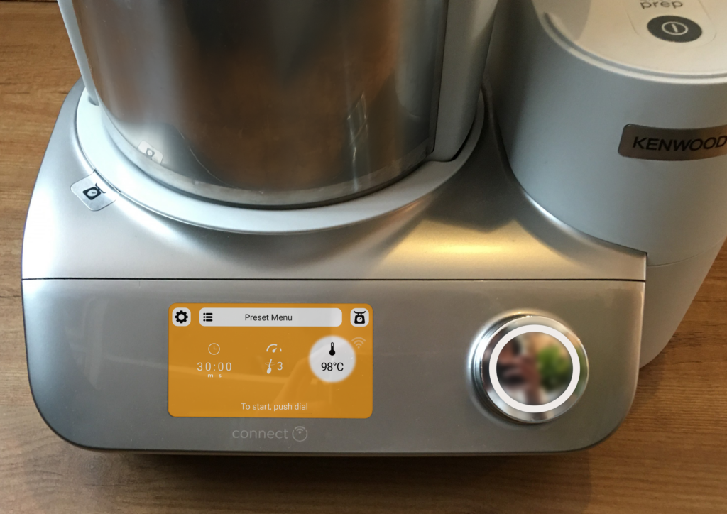
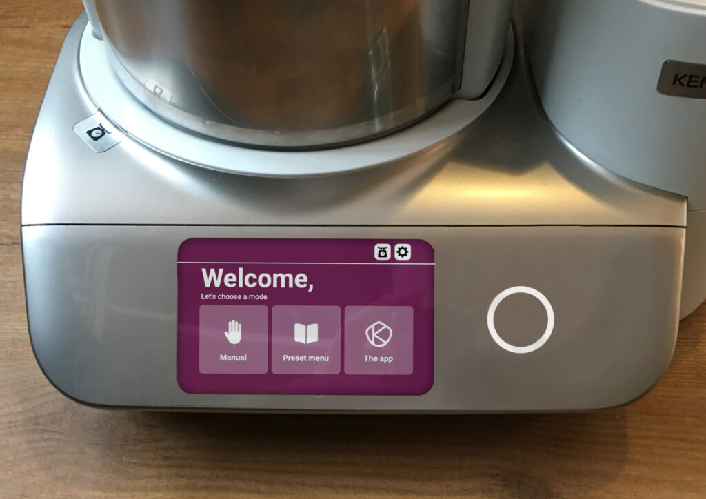
For case owner Kenwood, I worked in a group on a redesign of the user interface of the CookEasy+.
Product and Product Context Analysis
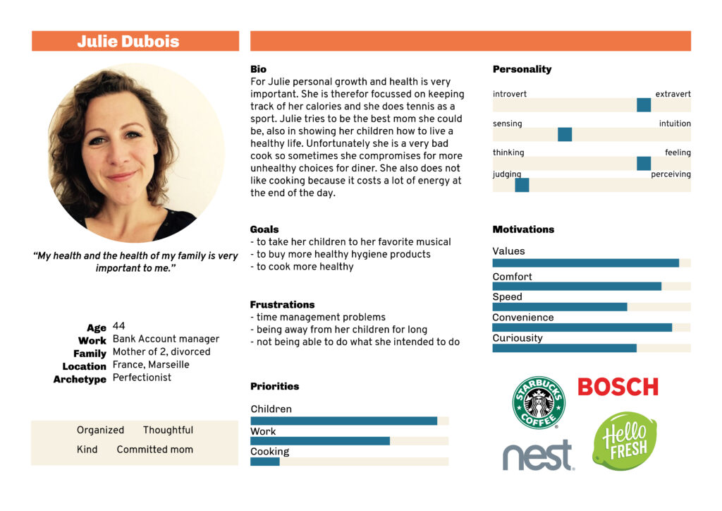
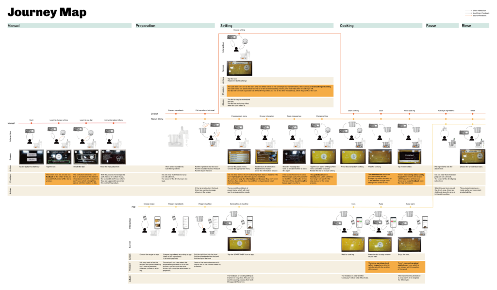
To analyse the product and context of use, a persona was made and the product was user tested. Based on the test, a journey map was created, showing the strong and weak points of the product.
Prototype test
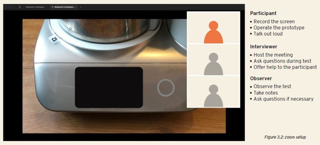
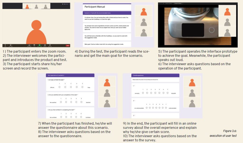
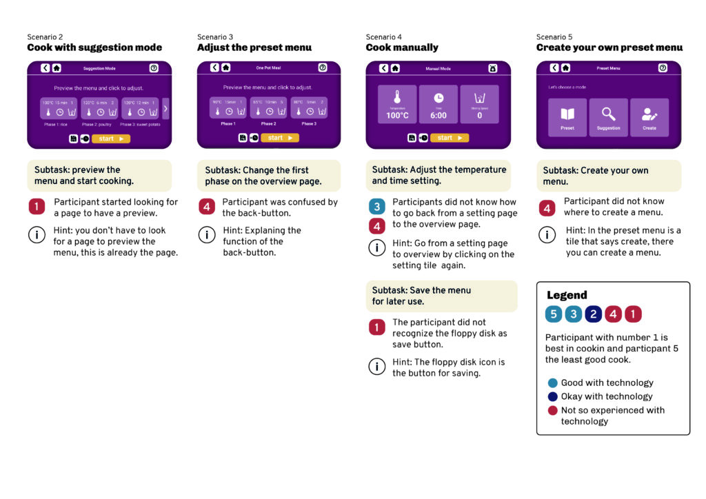
To test our design, a Figma prototype was made. Due to Covid-19 the tests were conducted online, using zoom. A link to the prototype and a link to a questionnaire were shared at the start. During the user test, participants were asked to speak out loud. During and after the test we asked questions to deepen our understanding of the user experience.
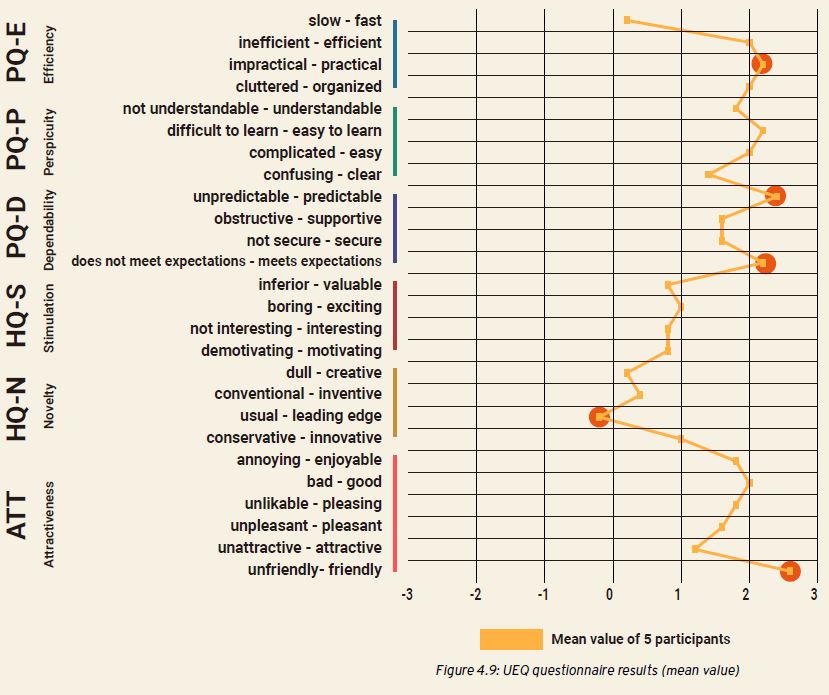
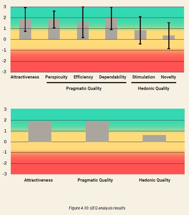
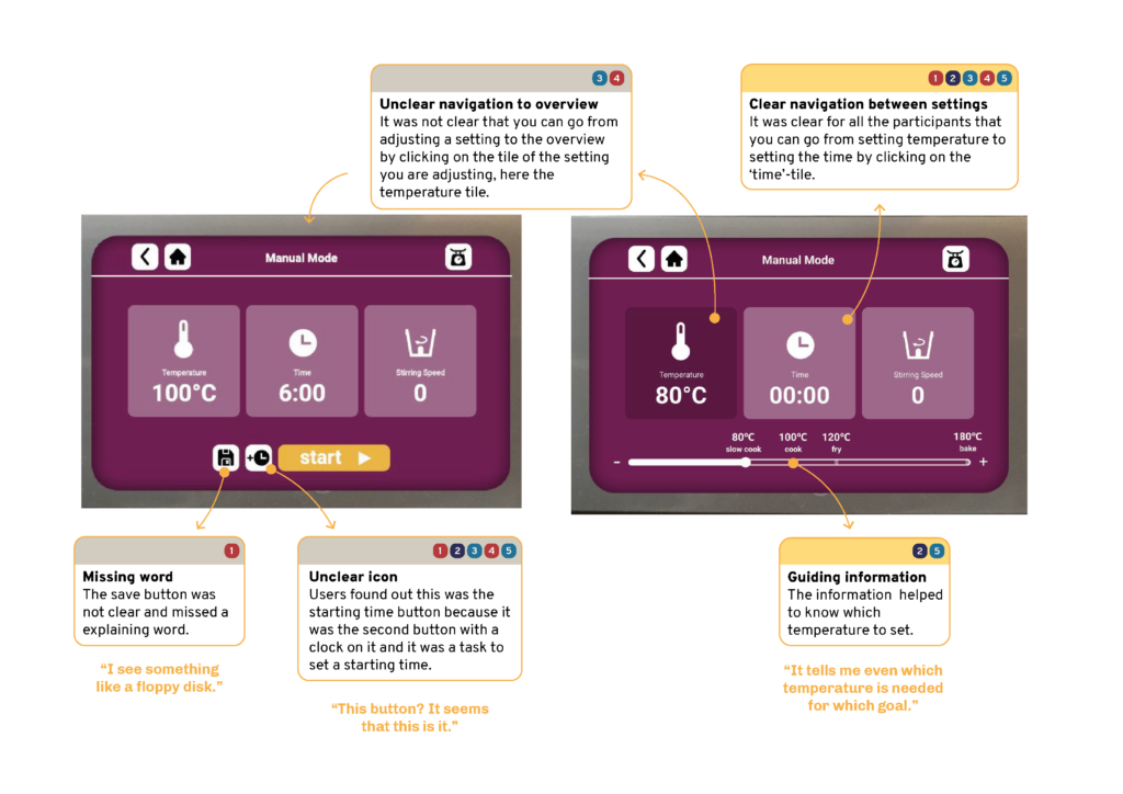
The UEQ questionnaire was used to define the user experience in order to evaluate the quality of the redesign. The test outcomes were clustered and both problems and strengths of the redesign were mapped on the different screens.
Final Redesign
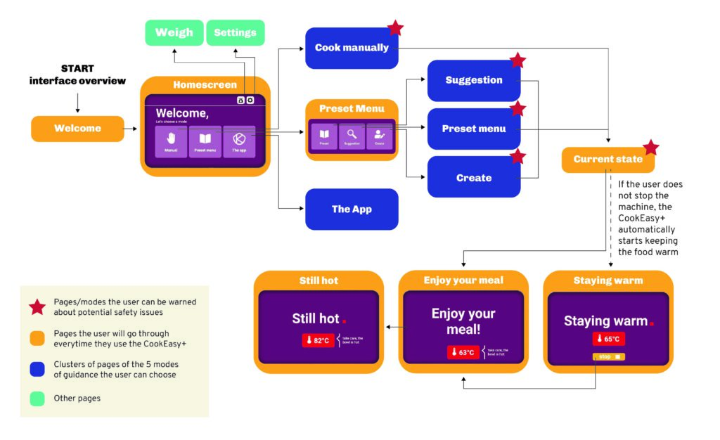
Based on the user tests, the redesign was improved. The visual layout of the interface was changed, adding more contrast and safety information. and creating more possibilities for making preset settings. After the project, the client reached out for further collaboration, speaking for the success of the project.
Design activities
- Conducting and analyzing interviews
- Stakeholder meetings (Kenwood)
- Ideation (UX & UI Design)
- Prototyping in Figma
- Concept evaluation with user tests
- Creating several reports and presentations
