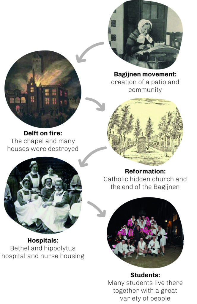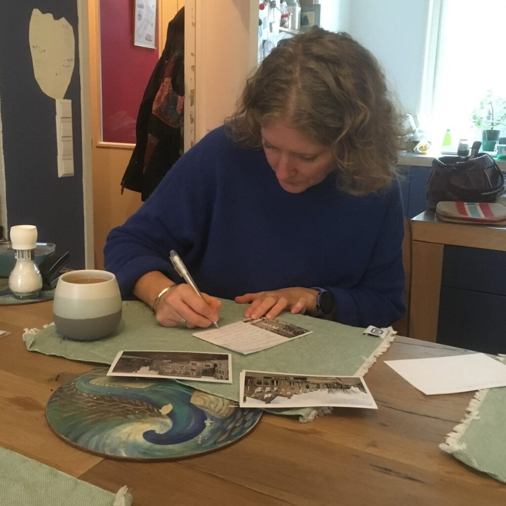
The goal of this project was to explore interactions. Interactions between people and interactions between people and objects. Prototyping was used as a tool to explore interactions of people with my designs and concepts. The Design Goal of the project was to ‘make people who are in the Bagijnhof feel connected to the past in a way that they feel part of history‘.
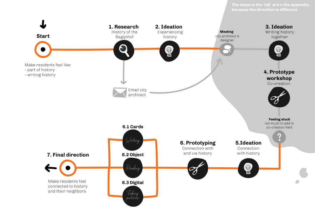
The project road map:
Context Analysis
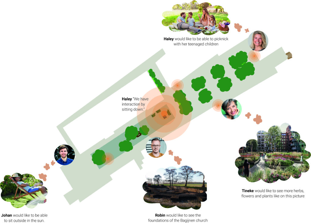
At the start of the project, the context was analysed by conducting 9 interviews. During the interviews, the residents were asked to map down their activities in the Bagijnhof and the places they spend their time. On the map below, the most common used spots are highlighted.
Prototyping and testing
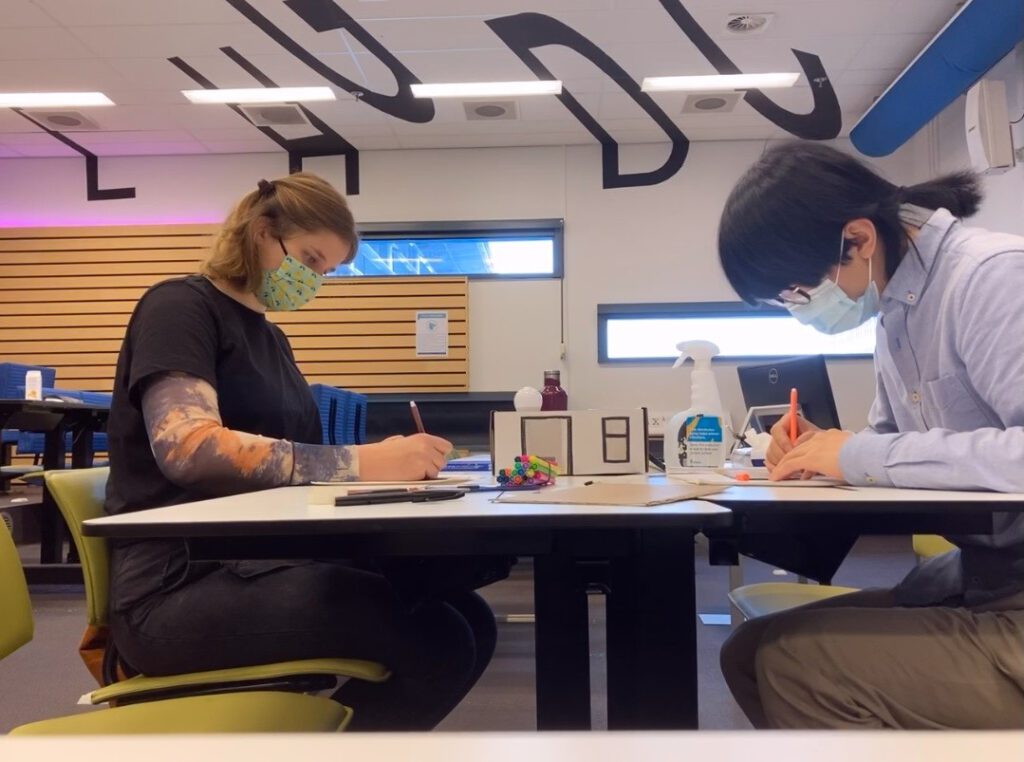
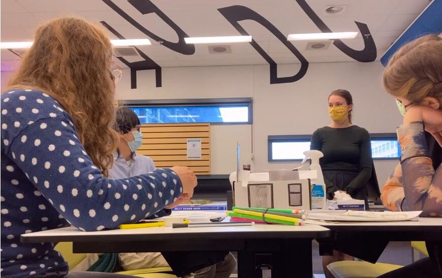
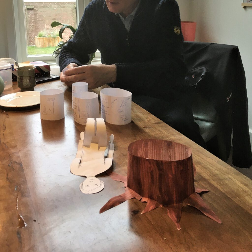
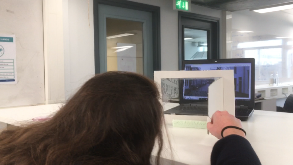
Prototyping was used to understand the need of the target group better. Because the municipality of Delft was redesigning the Bagijnhof, I looked into co-creation processes for the municipality to include residents in the design process. During a prototyping workshop I explored what the relation was between first designing the patio yourself and then co-designing it with others or the other way around.
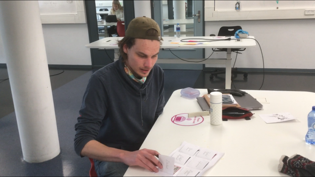
After that several prototype tests with interviews were conducted to iterate on the design direction, finding out what the residents and people in the Bagijnhof wanted.
Final Design
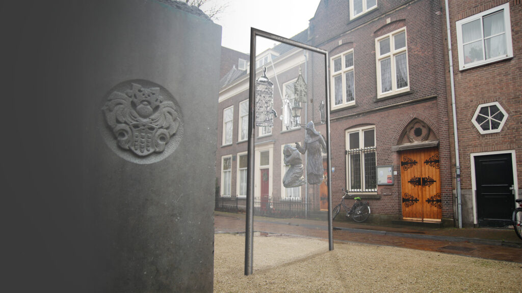
The final Design is a window showing elements of the past as an overlay over the present. Lines on the window show how the overlay should fit on the ‘background’.
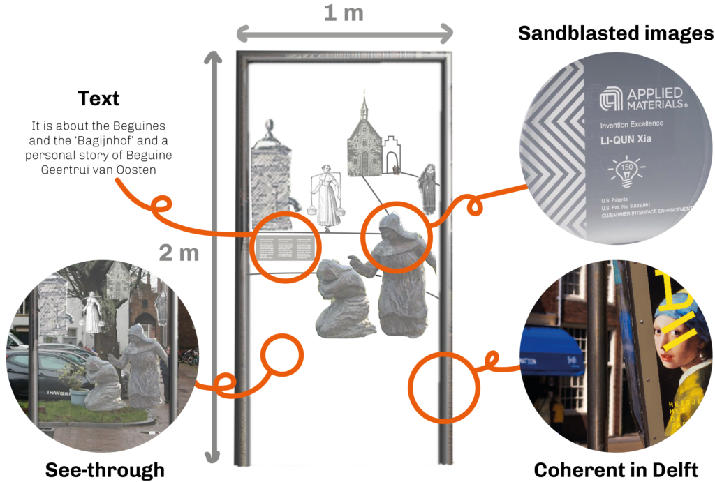
A visual of the final concept is presented in context. It shows an overlay of the historic period of the Bagijnhof.
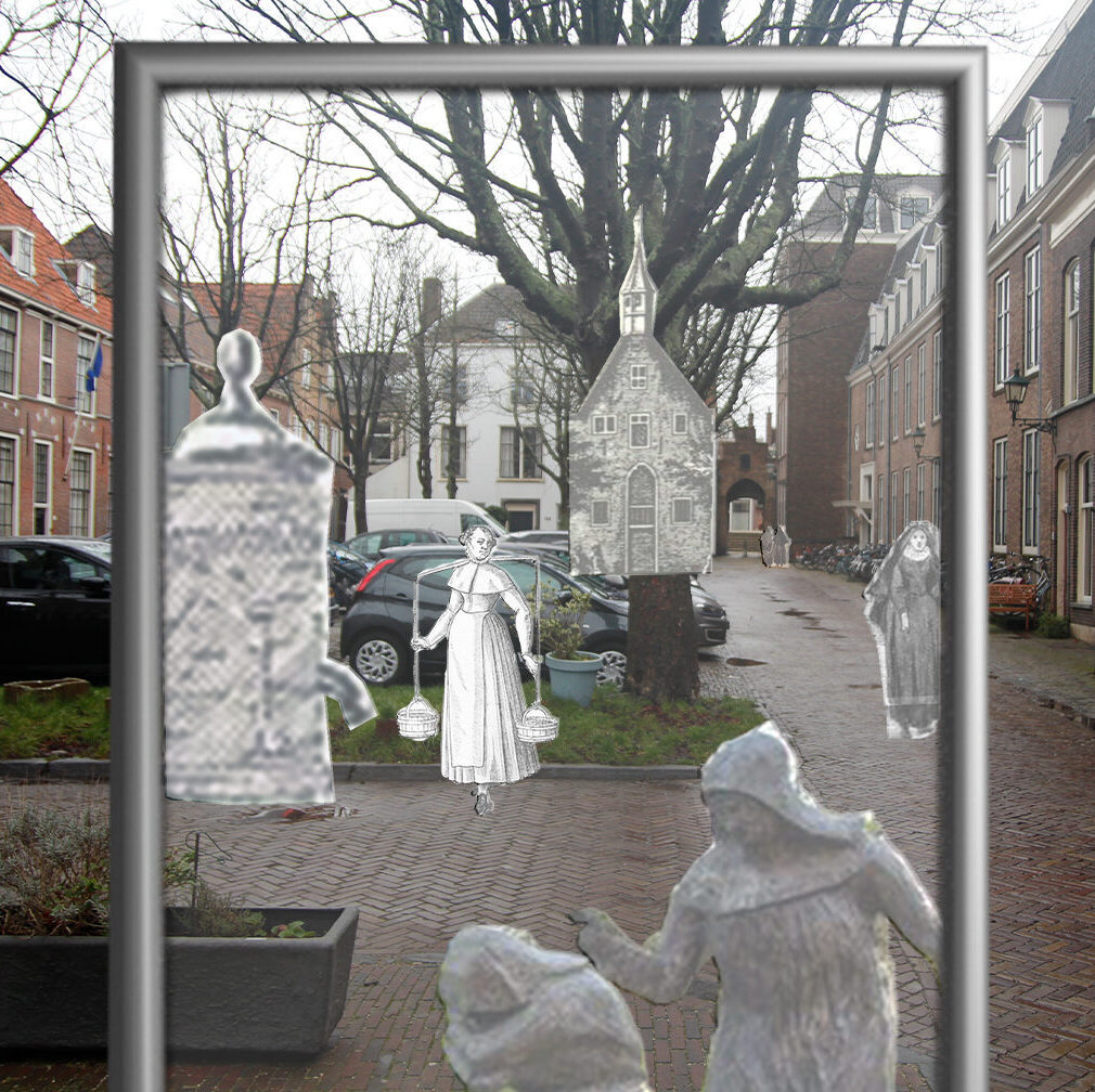
For the final presentation a small video was made to show the intended interaction of people in the Bagijnhof with the window.
Final Prototype Test
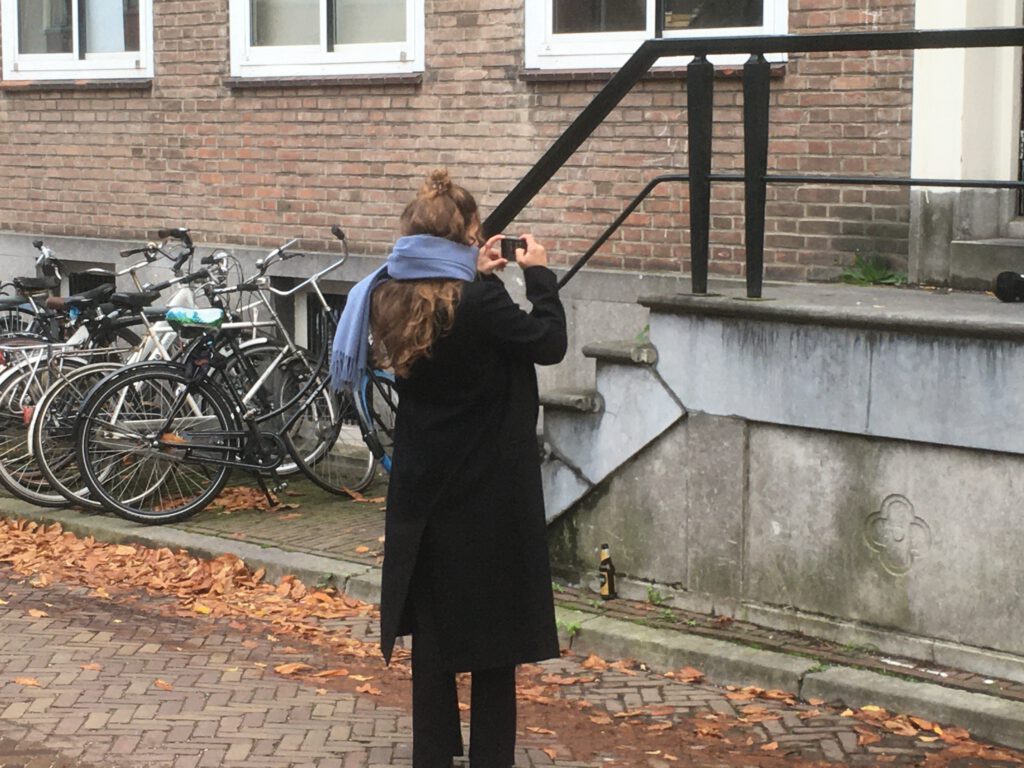
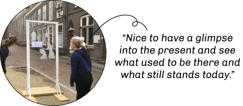
To learn how the people react to the window in the Bagijnhof, a prototype was made. From a distance I observed the people how they interacted with the window. Then I asked them some questions about their experience and understanding of the window.
From the prototype test, I got insights and recommendations were made:
- The design could be designed more inclusively for people with different lengths and for people in wheelchairs or the average length of the user should be considered to calculate the optimal height of the perspective.
- In the text there could have been made links to the present, as one participant pointed out;
- The text lenght and positioning could be tested in different forms;
- It should be made more clear from which side people have to look through the window and how the overlay fits on the background;
- To catch less wind, the surface could be shortened from the bottom.
Design activities
- Conducting and analyzing interviews
- Stakeholder meetings (Stadsbouwmeester, landscape designer and resident association)
- Ideation
- Prototyping
- Concept detailing
- Creating several reports and presentations
